(Bloomberg) It’s hard to think of a government agency as disliked as the IRS. In a recent poll, 12 percent of taxpayers said they liked Vladimir Putin better. Beyond the Internal Revenue Service itself, many Americans hate the whole idea of paying taxes. Twenty-seven percent of those polled said they would get an IRS tattoo if it meant a tax-free future. Eleven percent would clean the toilets at Chipotle.
And it’s impossible to imagine the IRS ever changing its image.
Or is it?
We asked three leading global design and brand strategy firms—Base Design, Chermayeff Geismar Haviv, and Siegel+Gale—to do just that. Here’s what they came up with.
Base Design
“We identified the ‘us against them’ relationship as the problem to address through design.”
To “rebuild the broken relationship the U.S. people have with the IRS,” the agency needs a mission beyond just being the nation’s tax collector, says Min Lew, partner and creative director. “Our taxes do go to fueling infrastructure, health care, education, the military, everything the country needs to operate. So why can’t there be a more productive, proactive, positive perception of the organization?”
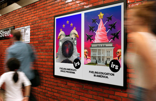
(Source: Base Design)
The subway posters are “aspirational, utopian collages of living the American dream, from buying a house to green energy to having kids that get a good education.”
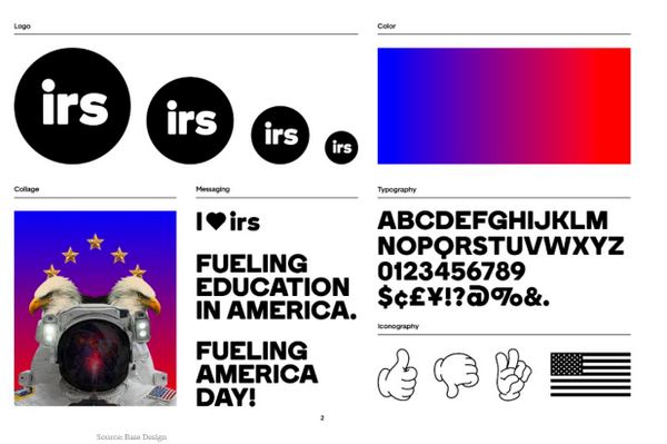
(Source: Base Design)
The rebranding campaign poster of an astronaut flanked by eagles is more than a reference to funding for space exploration. There’s a highway (visible in the subway poster up the page a bit) leading to the bottom of the helmet, and fireworks reflected in the visor. The progression of colors from blue to red is intended to project nonpartisanship and progress.
The font, called Boing, is “not cute but has a lot of detail and personality,” Lew says. “The typography is all black and white, and the color is all through iconography or collages. It’s familiar, clean, and neutral, yet it has a more accessible, humanistic personality.”
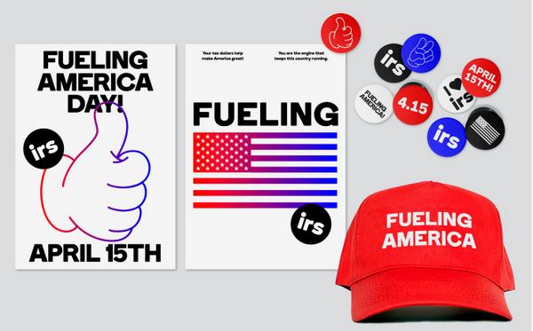
(Source: Base Design)
What’s up with the Mickey Mouse hand and familiar red hat? “We’re playing a little with the politics going on, the pop culture, to bring something new and fresh to the foreground, while it’s still very familiar,” Lew says. Base Design is known for its deft melding of high and pop culture, with clients that range from New York’s Museum of Modern Art to Kanye West.
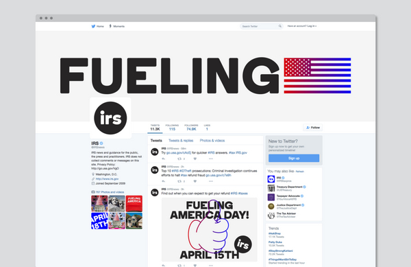
(Source: Base Design)
“Fueling” suggests energy. “If our mission was to rebuild, we wanted to be direct,” says Lew. “And we wanted to say that, at the end of the day, tax is the fuel to make everything happen.” (This year, Fueling America Day would be April 18th, but Tax Day is, of course, usually April 15th.)
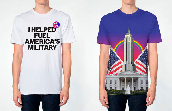
(Source: Base Design)
The iconography in the redesign is “not about party patriotism,” Lew says, “but about our collective aspiration—a utopian American dream.”
Chermayeff Geismar Haviv
“If the eagle’s wings make a heart, maybe it’s saying we love our country.”
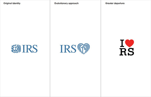
(Source: Chermayeff Geismar Haviv)
The 59-year-old firm is behind some of the world’s most familiar logos, including the NBC peacock and logos for Showtime, PBS, Armani Exchange, and Mobil Oil. So it was the IRS mark that partner Sagi Haviv, whom The New Yorker once described as “a logo prodigy,” focused on.
Most people don’t even know the IRS has a logo. “It’s not the worst graphic ever,” Haviv says diplomatically, “but it’s a hodgepodge of too many elements that don’t really go together. The eagle’s neck holding the scales is especially unfortunate,” and “there’s something about the stance of the eagle and the composition that makes the overall mark seem foreboding or even menacing.”
When the client is a government agency, Haviv likes to offer some conservative options. In the middle design above, he kept the logo’s color but jettisoned the scales of justice.
“I wanted it to be more in line with the desired qualities of approachability and cordiality,” he says. “Overall, it’s a softer and friendlier image. I’ve never seen an eagle showing heart, strength, care. Maybe the message is the IRS loves you, your country loves you, because by paying your taxes you get something back.”
The more daring redesign, at right, is modeled on Milton Glaser’s “I Love New York” ad campaign from the late 1970s.
“What we are looking for in a logo is something memorable,” Haviv says. “Often an unexpected twist on a familiar image can do the trick. Because we’re used to reading Milton Glaser’s famous mark in a particular way, the structure of the communication [in the redesigned logo] is shuffled. And because the viewer will need a second to figure it out, it forces an engagement that can help the mark burn into the mind.”
Siegel+Gale
Introducing a new way to pay.
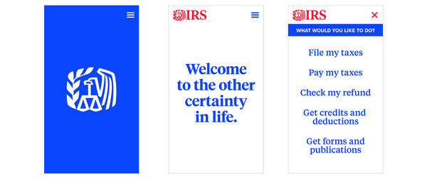
(Source: Siegel+Gale)
“The place where the IRS finds itself now is that it is reviled and feared,” says Chief Creative Officer Howard Belk. “And it’s mystifying as well, because it’s so hard to figure out how to actually do the right thing.”
Siegel+Gale may have more insight into the agency’s communication challenges than most. It helped the IRS slash the number of form letters it sends out to taxpayers from more than 1,000 to about 317, covering about 70 percent of all of its correspondence. Clients of the firm, which is known for its expertise in creating simple, clear brand messages, include CVS Health and Hewlett-Packard Enterprise.
The company’s campaign for the IRS is based on a radical idea: Taxpayers can choose to provide a service rather than write a check. The IRS would offer a selection of government-sponsored charitable organizations based on a taxpayer’s location, occupation, and age. A “Service Conversion Calculator” would then gauge the time and effort you’d have to dedicate to pay your taxes in kind.
Siegel+Gale created the campaign with the big demographic wave of millennials in mind. “Millennials are motivated by making a difference in the world, and crave experiences over possessions,” says Jennifer Eggers, group director of brand communication. She says they want to “see their taxes in action.”